
Blue is a color that evokes calm, confidence, and elegance. It’s a hue with remarkable flexibility—capable of creating both serene retreats and bold design statements. From powdery sky tones to deep navy, blue has become a go-to shade in modern interiors.
Whether you live in a coastal cottage or a downtown apartment, incorporating blue can refresh and redefine your space. It’s one of those rare colors that feels timeless yet continually on-trend. Best of all, it pairs beautifully with virtually any material or finish, from rustic woods to sleek metals.
In this guide, you’ll discover how to make blue the star of your home decor—without overdoing it. We’ll explore creative, stylish, and fearless ways to use this versatile color across different rooms, moods, and design styles. Let’s dive in and transform your spaces with the power of blue.
1. Understanding the psychology of blue in interiors
Blue is known for its calming and cooling effects. It lowers heart rate, encourages clarity of thought, and promotes feelings of tranquility—making it perfect for spaces meant for rest and reflection. But it’s also a color of depth and richness, often associated with trust, intelligence, and creativity.
Different shades convey different emotions: pale blues evoke airiness and light, while navy adds drama and sophistication. Teal and turquoise bring energy and flair. Understanding these nuances allows you to choose the right shade based on the mood you want to evoke in each room.
2. Start small: accent pieces that make a splash
Not ready to commit to a blue wall or sofa? No problem. Start with small but impactful elements. A set of navy throw pillows on a neutral couch, a turquoise vase on a dining table, or cobalt kitchen utensils can all introduce the color in subtle yet stylish ways.
Textiles are especially powerful. Think velvet cushions, woven rugs, or patterned curtains in varying tones of blue. These pieces are easy to switch out and let you experiment freely with the color palette until you find your perfect shade.
3. Blue on the walls: from bold statements to gentle backdrops
Painting your walls blue can instantly redefine a room. Light blues work beautifully in bedrooms, offering a restful, airy feeling. Deeper tones like indigo or midnight blue make a stunning impact in dining rooms, living rooms, or even powder bathrooms, where you can afford to be dramatic.
Consider finishes, too. Matte paint offers a soft, velvety look, while satin or semi-gloss adds depth and dimension. If you’re unsure about a full wall, try color-blocking or painting only the lower half of the wall for visual interest without overwhelming the space.
4. Pairing blue with other colors and materials
Blue is incredibly versatile when it comes to pairing. For a crisp, classic combo, match it with white. Want warmth? Add wood tones or brass fixtures. Seeking contrast? Try orange, mustard yellow, or coral accents. For luxury, pair navy or sapphire with marble and gold.
Don’t overlook texture. Blue velvet feels rich and indulgent, while blue linen offers a breezy, casual aesthetic. Playing with textures as well as color adds complexity and depth to your decor.
5. The blue kitchen: fresh, bold, and unforgettable
Blue is one of the hottest trends in kitchen design. Navy or deep cobalt cabinets instantly elevate the space, giving it a designer edge. Pair with white countertops and brass handles for a chic, balanced look. Or go modern with matte blue cabinets and black hardware.
If cabinetry feels like too big a leap, start with accessories: a navy kettle, blue tile backsplash, or indigo-patterned dish towels. These touches introduce color while keeping the overall look cohesive and fresh.
6. Blue in the bedroom: creating your personal sanctuary
Bedrooms and blue are a match made in heaven. Opt for lighter tones like powder blue or periwinkle to evoke serenity and openness. These hues are ideal for walls, bedding, or curtains and help promote relaxation and restful sleep.
Want something moodier? Deep navy walls paired with crisp white bedding and metallic lighting create a cozy yet sophisticated atmosphere. Add a velvet tufted headboard in royal blue for an ultra-luxurious feel.
7. Playing with blue in the bathroom
Bathrooms are great places to get creative with blue. Tiles in turquoise, seafoam, or even navy can bring a spa-like ambiance or a coastal vibe. Try blue mosaic tiles in the shower or an ocean-inspired wallpaper to make a statement in a powder room.
You can also add blue with towels, bath mats, and accessories. These are easy to change and allow you to adapt your decor with the seasons or your mood.
8. Living rooms that live in blue
The living room is the heart of the home, and blue can help define its personality. A plush navy sofa can serve as a grounding element, while lighter blue walls create openness and calm. Layer different shades through pillows, art, and decorative items for a curated feel.
Consider an accent chair in sky blue, a coffee table with a teal base, or an abstract painting featuring ocean hues. Blue helps tie the elements together while offering a flexible backdrop for evolving styles.
9. Going monochrome: layering blue upon blue
A bold but rewarding approach is going full monochrome. Use various shades of blue—light, medium, and dark—to build a layered, cohesive look. Think baby blue walls, navy furniture, and cobalt ceramics all working in harmony.
This approach works especially well with minimalist or Scandinavian interiors, where the play of tone and texture takes center stage. Just be sure to add in some neutral or natural elements (like wood or cream) to keep the room from feeling flat.
10. Don’t forget the ceiling and floor
For the creatively bold, blue floors or ceilings can create a stunning impact. A pale blue ceiling, sometimes called a “haint blue,” is a Southern tradition that adds charm and freshness. Deep blue tiles or rugs on the floor anchor a space and introduce depth.
Consider painting ceiling beams in a muted blue or using blue epoxy floors in a modern loft. These unconventional uses of color elevate your decor from ordinary to unforgettable.
11. Using blue to define zones in open-concept spaces
In open-plan homes, color can help define different areas without building walls. Use blue to separate the dining space from the kitchen, or to highlight a cozy reading corner in a large living room.
You might paint one wall a deep blue or use a large rug in ocean tones to frame a section of the room. These visual cues help organize the space and make it feel more intentional and styled.
12. Blue for seasonal transitions
One of the best things about blue is how it shifts effortlessly across seasons. Soft sky blues feel right for spring, aqua works for summer, deep denim adds richness in fall, and navy brings elegance in winter.
You can rotate blue accents with the seasons—swap out summer’s sea-glass tones for winter’s moody navy or add deeper textures like wool and velvet as the weather cools. This creates a dynamic home without redecorating entirely.
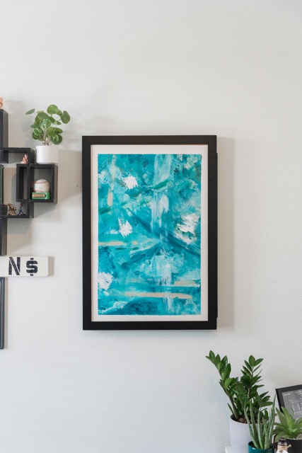
13. The art of blue in gallery walls
Incorporating blue into your artwork is another sophisticated way to introduce the color. Whether through abstract pieces, coastal photography, or vintage prints, art allows you to highlight blue without it feeling forced.
Frame your pieces in black, gold, or light wood for contrast. Hang them on a blue accent wall or let the art itself be the blue element. Either way, it adds personality and intentionality to your decor.
14. Blue outdoors: patios, balconies, and gardens
Don’t forget the exterior! Blue furniture, planters, or textiles can transform outdoor spaces. Think cobalt cushions on a bench, a navy umbrella over your dining table, or turquoise pots filled with greenery.
These choices make your outdoor space feel like an extension of your home—stylish, welcoming, and cohesive. Bonus: many blue materials are fade-resistant and well-suited for sun-exposed areas.
15. Final thoughts: letting blue express your design identity
Blue is more than just a color—it’s an expression of your personality, your taste, and your lifestyle. Whether you use it boldly or subtly, it’s a hue that offers endless creativity and inspiration. With the right choices, blue can transform your home into a sanctuary of style and self-expression.
16. Blue and lighting: how illumination changes everything
Lighting plays a pivotal role in how blue tones are perceived. A navy wall might look rich and luxurious in natural daylight but appear nearly black under yellow-toned artificial light. Similarly, pale blue can seem crisp in morning sun and slightly gray in cooler evening lighting.
To get the best out of your blue decor, test samples at different times of day and with both warm and cool bulbs. In rooms with little natural light, opt for lighter shades of blue with warmer undertones to avoid a cold or sterile feel.
Accent lighting can also enhance your blue features. Use spotlights to highlight a blue art piece or install LED strips under cabinets to make blue tiles glow.
17. Blue in eclectic and maximalist interiors
If your design style leans eclectic or maximalist, blue can be a fantastic base or accent color. Think saturated electric blues, jewel-toned turquoises, or vibrant ultramarine blended with clashing patterns, layered textures, and bold artwork.
In these interiors, blue acts as a visual anchor that brings balance to the chaos. A blue velvet sofa, for instance, can ground a room filled with patterned rugs, mismatched chairs, and eccentric accessories. Don’t shy away from drama—this is where blue gets to shine at full volume.
18. Choosing the right finish: matte, glossy, or textured blue
Beyond the shade itself, the finish you choose for blue surfaces dramatically alters the aesthetic:
| Finish Type | Best For | Effect in the Room |
|---|---|---|
| Matte | Walls, large furniture | Soft, elegant, modern |
| Glossy | Accent tiles, cabinetry | Reflective, vibrant, bold |
| Textured | Wallpaper, fabrics | Rich, layered, tactile |
Textured blue wallpaper, for example, can add depth and movement to a feature wall. High-gloss navy kitchen cabinets reflect light and create drama. Matte blue paint feels calming and sophisticated, especially in bedrooms or reading nooks.
19. Blue in kids’ rooms and nurseries
Blue isn’t just for boys anymore. It’s becoming a gender-neutral favorite for nurseries and children’s spaces thanks to its calming effects and versatile palette.
Soft powder blues or minty teals are perfect for nurseries, especially when paired with white furniture and natural wood. In older kids’ rooms, denim blue walls, fun turquoise lamps, or deep blue bookshelves can introduce fun and personality without overwhelming the space.
To keep it playful, add themed decor—like starry night wallpaper or ocean-inspired bedding. Blue is imaginative, and in kids’ rooms, that’s a major plus.
20. Using blue in entryways and hallways
Entryways are often overlooked when it comes to decor, yet they set the tone for your entire home. A blue front door, for example, creates instant curb appeal and gives a stylish first impression.
Inside, try a navy accent wall in a hallway or a powder blue console table with a mirror above it. These narrow spaces benefit from cooler hues that feel fresh and open. Add lighting to keep it from feeling dark, and don’t forget blue accessories like vases or rugs.
21. Incorporating blue into boho and earthy styles
You might not think of blue as a go-to color for bohemian or earthy interiors, but with the right pairing, it works beautifully. Think dusty indigo with terracotta, or sky blue with woven natural fibers.
The trick is to use blue as an accent rather than a base. A Moroccan-style rug with navy motifs, ocean-toned pottery, or a macramé wall hanging dipped in indigo adds that touch of color while still keeping the overall aesthetic grounded and organic.
22. Blue in vintage and retro decor
Blue has long been a staple in mid-century and retro styles. From the robin’s egg blues of the 1950s to the deep teal velvets of the 1970s, the color carries nostalgic charm.
Bring retro blue into your space with powder blue appliances, vintage tiles, or upholstered armchairs in bright turquoise. Match it with walnut wood, brass, or geometric prints to stay true to the era. Whether you’re going full vintage or just adding a touch, blue helps bridge the past and the present.
23. Blue in home offices and creative studios
Need to boost productivity and calm your mind at the same time? Blue is a winner in home offices and creative workspaces. Lighter blues can enhance focus, while deeper shades can spark imagination.
Try a dusty blue accent wall behind your desk, or shelves painted in slate blue. For a bolder move, go monochrome with walls, furniture, and décor in layered tones. Don’t forget to add greenery—blue and green are natural companions that promote mental clarity and a sense of balance.
24. The power of contrast: using blue with black and white
Blue works well in both high-contrast and tone-on-tone designs. When paired with black and white, it takes on a crisp, editorial feel. A navy sofa against a white wall with black-framed artwork, for example, feels timeless and bold.
This trio is especially effective in minimalist or modern interiors. It creates structure, focus, and a balanced tension that’s visually compelling. Add touches of natural textures—like a jute rug or a wooden table—to soften the contrast and bring warmth.
25. Emotional impact of different shades: a quick reference guide
Here’s a handy visual table comparing popular shades of blue and the moods they evoke in interiors:
| Shade of Blue | Mood/Effect | Best Used In |
|---|---|---|
| Powder Blue | Calm, airy, clean | Bedrooms, nurseries, bathrooms |
| Sky Blue | Uplifting, fresh | Kitchens, ceilings, small spaces |
| Teal | Energetic, artistic | Living rooms, creative spaces |
| Navy Blue | Elegant, grounding | Dining rooms, offices, hallways |
| Cobalt Blue | Bold, contemporary | Kitchens, entryways, accents |
| Denim Blue | Relaxed, vintage | Bedrooms, boho spaces |
| Indigo | Introspective, deep | Reading nooks, moody lounges |
| Turquoise | Playful, beachy | Kids’ rooms, patios |
Use this table as a guide when choosing shades for specific moods or functional needs in your home.
26. Mixing blue with metallics: from glam to industrial
Metallics bring out the best in blue. Gold + navy is a luxe classic, perfect for art deco or glam interiors. Chrome + cobalt feels futuristic and sharp, ideal for contemporary or industrial settings. Copper + teal adds warmth and vibrancy.
You can apply this combo through lighting fixtures, hardware, frames, mirrors, and furniture legs. The key is balance: use metallics as accents so the blue remains the visual focus without feeling cold or overly flashy.
27. Sustainable and eco-friendly blue decor
Blue isn’t just stylish—it can be sustainable, too. Choose eco-friendly paint brands that offer low-VOC blue options. Opt for vintage or reclaimed furniture painted in sky or navy tones. Use natural indigo-dyed textiles for throws, pillows, or curtains.
Sustainable design is about intention. When your blue choices also support the planet, your home becomes not just a beautiful space—but a meaningful one, too.
28. Blue in transitional spaces: stairs, landings, and laundry rooms
Even the most utilitarian spaces deserve beauty. Stairs painted in gradient blues, laundry room walls in powder blue, or a landing with a navy gallery wall all add joy to overlooked areas.
These spaces are often small and low-traffic, making them ideal testing grounds for bold color experiments. Think of them as design playgrounds—let your imagination take the lead.
29. Combining warm blues and cool blues for complexity
Many people think of blue as purely cool, but warmer blues—like periwinkle or steel blue—have undertones of red or violet that add complexity. Combining these with cooler tones like azure or cyan creates a rich, layered environment.
This technique works well in artistic or eclectic homes. It keeps the color palette cohesive but adds dimension and emotion. If you’re unsure how to pair them, start with a warm blue base (like on a rug or wall) and layer in cooler accents.
30. Curating a blue-themed shelf or niche
One of the simplest ways to integrate blue into your home is by styling a single shelf or open niche with blue-themed objects. Think stacked navy books, a pale blue ceramic vase, a small ocean-themed painting, and a teal candle.
This micro-vignette draws the eye and allows you to express creativity without redoing a whole room. It’s also an excellent trick for renters or those who like to refresh decor seasonally.
Conclusion
Incorporating blue into your home decor opens the door to creativity, elegance, and bold personal expression. Whether you’re embracing soft powder tones or deep indigos, blue offers the flexibility to suit every taste, room, and design ambition. It’s not just a color—it’s a tool for transformation.
If you’ve been hesitant about using blue in your spaces, now is the time to experiment. Use the tips from this guide to find the shades, pairings, and placements that feel right for you. Let your space reflect the confidence and creativity that blue embodies.
Frequently Asked Questions
1. Is blue a good color for small rooms?
Yes! Light shades of blue can actually make small rooms feel larger and more open, especially when paired with mirrors and light-colored furniture.
2. What colors go well with blue in home decor?
Blue pairs well with white, gray, beige, mustard, pink, orange, and metallics like brass or gold. The contrast or harmony depends on your chosen shade.
3. Can I mix different shades of blue in the same room?
Absolutely. Layering various shades adds dimension and richness. Just balance it with neutrals or textures to avoid visual overwhelm.
4. How do I keep blue decor from feeling too cold?
Add warmth with wood, warm metals (like brass or copper), cozy textures (wool, velvet), and accent lighting to create a more inviting feel.
5. Is navy blue still trendy in 2025?
Yes. Navy remains a favorite among designers—it’s elegant, timeless, and works across styles from modern to traditional.
Writing is my passion. I have been writing stories since I was a little kid, and I am grateful that I can continue to write and help people through my content. With a degree in Marketing, I truly love studying, especially when I can enjoy a good cup of coffee at the same time.